10 HTML/CSS Mini-Projects That Teach Real Layout Skills (with Rubric)
Updated on February 03, 2026 12 minutes read
If you’ve copied HTML/CSS from tutorials and still freeze when building a page from scratch, you’re not “bad at CSS.” You’ve just hit the part most beginners avoid: layout that must survive real screens, real content, and real edge cases.
This guide is for adults upskilling, career-changing, or preparing for an online program. You’ll practice layout through small, shippable HTML/CSS mini projects that build confidence quickly and create portfolio-ready proof.
Why layout is the skill that makes everything else easier
Styling is choosing colors and fonts. Layout is making a page behave correctly when things change: the screen gets smaller, a title gets longer, or a card needs to stretch to match another card. That’s where “CSS knowledge” becomes a professional skill.
In real work, you’re constantly aligning mismatched content. Buttons have different label lengths, images aren’t consistent, and users zoom in on text. Strong layout is the ability to keep a design readable and stable, no matter what.
Once the layout clicks, everything you learn later becomes simpler. JavaScript, frameworks, and APIs are easier when your UI is already structured, responsive, and predictable because you aren’t fighting CSS at the same time.
How to use these mini-projects (so you actually improve)
These projects work best as a loop: build → stress-test → fix → ship. Your first version only needs to work at one screen size. Then you break it on purpose, fix what fails, and ship a clean, documented result.
Create one repository (for example, html-css-layout-mini-projects) and make
one folder per project: 01-navbar/, 02-pricing/, and so on. Add a screenshot
and a short README per project, plus a live deployment link.
Time-boxing keeps momentum high. Aim for 60–120 minutes for a first pass, then 30–60 minutes for responsiveness and polish. The goal isn’t “perfect CSS” it’s repeatable progress you can show to employers.
The Layout Skills Rubric (score every project honestly)
A rubric prevents the “it looks fine on my laptop” trap. After each project, score yourself 0–4 in each category, then write two notes: one win and one Upgrade you’ll apply in the next project.
Use this scale consistently. A “2” is solid and usable, a “3” is strong and clear, and a “4” is portfolio-ready meaning it holds up under stress and reads like professional work when someone inspects your code.
Scoring scale (0–4)
- 0) Not working: broken layout, overflow, missing key behavior.
- 1) Basic: mostly works, but inconsistent spacing or fragile responsiveness.
- 2) Solid: works across screens with minor issues; code is readable.
- 3) Strong: clear structure, good responsiveness, accessible details.
- 4) Portfolio-ready: polished, resilient, and documented with intent.
Rubric categories (score each 0–4)
| Category | Strong (3) | Portfolio-ready (4) |
|---|---|---|
| Layout structure | Containers + alignment rules are clear | Layout system is intentional and repeatable |
| Responsiveness | Mobile-first flow + clean breakpoints | Fluid sizing + edge cases handled confidently |
| Flexbox/Grid usage | Right tool used most of the time | Modern patterns used well (areas, auto-fit, minmax) |
| Accessibility & semantics | Semantic HTML + visible focus | Keyboard-friendly + headings/labels/contrast are solid |
| Code quality | Consistent naming + reusable classes | Variables/utilities + tidy architecture + minimal “magic” |
| Polish & documentation | Looks clean + README exists | Screenshot + live link + explains decisions and trade-offs |
A helpful habit is adding a “stress test” checklist to every project. Shrink the screen, paste in an extremely long headline, zoom to 200%, and tab through the page. If it still works, your layout skill is improving fast.
A tiny CSS foundation that makes layouts easier
Most layout problems come from inconsistent defaults. A small baseline keeps measurements are predictable and make your spacing system consistent across projects, browsers, and screen sizes.
Add something like this to each style.css, then adjust the variables as you
develop your own spacing and typography rhythm.
*,
*::before,
*::after { box-sizing: border-box; }

: root {
  --space-1: 8px;
  --space-2: 16px;
  --space-3: 24px;
  --space-4: 32px;
  --radius: 12px;
  --max: 1120px;
}

body {
  margin: 0;
  font-family: system-ui, -apple-system, Segoe UI, Roboto, Arial, sans-serif;
  line-height: 1.5;
}

img { max-width: 100%; display: block; }

.container {
  width: min(100% - 2rem, var(--max));
  margin-inline: auto;
}
This isn’t about making every project look identical. It’s about removing random defaults, so your layout choices are the main thing you’re practicing and improving.
10 HTML/CSS mini-projects that build real layout skills
Each project below includes a build goal, the key layout skills it trains, and upgrades that push you into “job-ready” territory. Build the simplest working version first, then level it up using the rubric.
1) Responsive navbar with dropdown (Flexbox + positioning)
A navbar looks easy until you add a dropdown and try to keep spacing consistent. This project teaches alignment, click-target sizing, and interactive states that still work for keyboard users.
Build a desktop layout with a logo on the left and a row of links on the right. On smaller screens, switch to a stacked layout or a simple “menu placeholder.r” state (no JavaScript required). Focus on clean spacing, not fancy animation.
Add one dropdown with position: relative on the parent and position: absolute '. on the dropdown panel. Support :focus-within` so the submenu is reachable via
keyboard, not only via hover.
Upgrade by testing long link text and ensuring the dropdown never clips off the
screen. For a strong rubric score, make focus rings visible and keep spacing
uniform using gap instead of random margins.
2) Pricing table (Grid + equal-height cards)
Pricing tables train consistency: consistent padding, consistent spacing, and consistent alignment especially when one plan has more content than another. It’s a fast way to practice “professional-looking” layout decisions.
Build three pricing cards in a row on desktop and stack them on mobile. Add a “Most Popular” badge on one card that feels integrated rather than floating in a random spot. Keep typography hierarchy clear and calm.
Use Grid for the outer columns and gap for spacing. Inside each card, use
Flexbox so the CTA button aligns at the bottom, even when feature lists differ.
Avoid fixed heights unless you can defend them.
Upgrade by adding a “monthly/annual” toggle UI (layout only) and ensuring prices don’t cause layout shift. For top scores, test with very long feature text and confirm the cards remain readable and aligned.
3) Blog/news card grid (auto-fit + minmax)
This project is a direct lesson in real content variability. Some titles are one line, some are three lines, and excerpts can be short or long. Your layout must still feel consistent and clean.
Build a grid of article cards with an image area, title, excerpt, and meta
details. Make the grid responsive with repeat(auto-fit, minmax(...)) so it
adapts smoothly without relying on many breakpoints.
Avoid the “fixed-height trap.” Instead of forcing all cards to a hard height, let content flow naturally and use optional clamping only as a progressive enhancement if you want a more uniform look.
Upgrade by adding category chips that wrap cleanly and never overflow. For high rubric scores, paste intentionally “messy” content, and confirm the layout stillLookss balanced on mobile, tablet, and desktop.
4) Documentation layout with sticky sidebar (real two-column pages)
Documentation layouts show up in product teams everywhere. This project trains two-column structure, readable line length, and scroll behavior that feels like a real app or knowledge base.
Build a left sidebar navigation and a main content area. Use position: sticky.
on desktop so the sidebar stays visible while content scrolls, but remains part
of the normal document flow.
On mobile, collapse to a single column and place navigation at the top. Your The goal is clarity and scannability, not squeezing two columns into a narrow screen.
Upgrade by adding an “On this page” block (static is fine) and styling headings for readability. For top scores, ensure the main text never becomes too wide, and that spacing is consistent between sections.
5) Landing page hero + split section (hierarchy and flow)
This mini-project teaches composition. A hero isn’t just centered text it’s hierarchy, spacing rhythm, and a layout that remains confident when stacked on mobile.
Build a hero with a headline, supporting paragraph, and two buttons. Add a split section below with text on one side and an image/illustration block on the other. Make sure the split stacks cleanly on mobile in a logical reading order.
Use Grid or Flexbox for the split layout and rely on consistent spacing tokens instead of one-off margins. Keep the content width comfortable so the hero feels premium, not cramped.
Upgrade with a small trust row (logos or stats) that wraps naturally. For high
rubric scores, use fluid typography (like clamp()) so headings don’t wrap
awkwardly on small screens.
6) Product page gallery (nested layouts + overflow control)
Product pages are layout puzzles: image gallery, thumbnails, price block, and form controls. This project is excellent practice for nested Flex/Grid layouts that must stay stable under pressure.
Create a desktop layout with a large main image and a thumbnail column. On mobile, convert thumbnails into a horizontal row or small scroll area so the UI remains usable without shrinking everything.
Add a product details area with price, variant selectors, and an “Add to cart.t” button. Focus on aligning labels and inputs, and make sure touch targets are comfortable on mobile.
Upgrade with a sale badge and ensure it doesn’t overlap important content. For a strong rubric score, eliminate horizontal scrolling, ng and confirm the layout stays clean even when product names and option labels are long.
7) Dashboard layout (grid-template-areas + app structure)
Dashboards are recruiter-friendly because they show planning. This project teaches page scaffolding: header, sidebar, main content, and optional panels that reflows correctly on different screens.
Use grid-template-areas to define the main regions. Inside the main region,
build a responsive card grid for metrics or chart placeholders that adapts as
the screen changes.
On mobile, reflow the layout by rearranging regions instead of shrinking everything. A good dashboard stacks intelligently: the sidebar becomes a top section, and secondary panels move below the main content.
Upgrade by adding a compact “quick actions” row and ensuring it wraps cleanly. For top scores, keep the CSS readable and avoid brittle positioning rules that only work at one screen size.
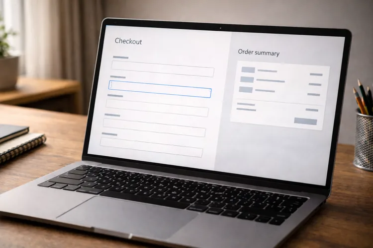
8) Checkout form layout (forms are layout skill tests)
Forms expose layout weakness fast. Labels, inputs, helper text, and error states need consistent spacing and alignment, or the page feels stressful and messy. This project trains calm, structured UI.
Build a two-column checkout on desktop: form on the left and order summary on the right. On mobile, stack everything into a single column with a clear reading flow and comfortable spacing.
Use Grid for grouped rows like city/state/postcode and ensure inputs align cleanly. Add visible focus styles and clear label associations so keyboard users can move through the form easily.
Upgrade by making the order summary sticky on desktop and ensuring it never overlaps content. For high rubric scores, the form should feel trustworthy, scan-friendly, and consistent at every breakpoint.
9) Responsive timeline (alignment + storytelling)
Timelines are useful for “career journey” sections and case studies, and they’re great practice for precise alignment. This project trains spacing, ordering, and decorative elements that don’t drift when text wraps.
Build a timeline with dates and descriptions. On the desktop, include a vertical line and clear markers; on mobile, simplify to a single-column layout that keeps the sequence obvious.
Use pseudo-elements for the line and dots, anchored to stable containers. Test uneven content lengths and ensure the line and dots stay aligned even when descriptions wrap to multiple lines.
Upgrade with icons or subtle motion, and respect prefers-reduced-motion. For
top scores, the timeline should remain readable at 200% zoom and never rely on
fragile “magic numbers.”
10) Newsletter layout (constraint-based professionalism)
Newsletter layouts teach defensive design thinking. Even if you never specialize In email, the discipline transfers to production UI: clarity, consistency, and robust structure under constraints.
Build a centered container newsletter with a header, hero section, body text, a primary button, and a footer. Keep hierarchy obvious and spacing consistent. Avoid over-designing; simple and readable wins.
Write a README that explains constraints and what you prioritized. The portfolio The value here is showing you can work within limitations and still ship quality.
Upgrade with a two-column section that stacks cleanly. For top scores, include screenshots of testing environments and document any compromises you made.
Turn these mini-projects into a portfolio that gets callbacks
Mini-projects become credible portfolio pieces when you present them like real deliverables. That means clean structure, live demos, and short explanations of your decisions, not just a screenshot.
For each project, add a README with: the goal, the layout approach (Flex vs Grid and why), the responsiveness strategy, and one tricky problem you solved. Include a live link and a screenshot so reviewers can evaluate quickly.
Finally, build an “index” page that links all 10 projects with thumbnails. That index becomes an extra project and shows organization, consistency, and real developer habits.
Where Code Labs Academy fits if you want structure and feedback
Self-study can work, but many learners plateau because they don’t know what “job-ready” looks like yet. High-quality feedback is often the difference between a layout that merely works and a layout you can defend in interviews.
If you want a structured curriculum and portfolio-driven learning, explore Code Labs Academy and its online bootcamps. For a layout-heavy front-end practice, the Web Development Bootcamp is the most direct match.
When you’re ready to prepare for job applications, the Career Services Center can support portfolio polish, job-search strategy, and interview prep. If you want help choosing a path, you can also. Schedule a Call to talk through goals, pacing, and next steps.
Quick layout checks that prevent most bugs
When something looks wrong, inspect the parent container first. Many issues come
from missing gap, inconsistent padding, or an unexpected display value that
changes how children align and wrap.
Test at three widths every time: around 375px (mobile), 768px (tablet), and 1200px (desktop). Then stress-test content: paste long text, increase font size, and confirm nothing overflows.
Finally, keyboard-test every project. If tabbing feels confusing or focus styles are invisible, your layout isn’t finished even if it looks good with a mouse.
Conclusion: layout confidence comes from small wins you ship
HTML/CSS layout isn’t about memorizing properties. It’s about building a system that holds up when screens change and content gets messy. These 10 projects are designed to train exactly that kind of real-world reliability.
Use the rubric, improve one thing at a time, and ship every project with a live link and a short README. That steady output becomes proof of skill, exactly what employers want to see.
If you want to accelerate with structured learning, mentoring, and career support, explore Code Labs Academy’s bootcamps or apply when you’re ready to start.