Figma Auto Layout for Beginners: The Only Concepts You Need
Updated on April 05, 2026 6 minutes read
Designing user interfaces can quickly become frustrating when elements don’t stay aligned, spacing feels inconsistent, and layouts break when content changes. For beginners, this often leads to hours of manual adjustments and confusion about what’s “right.”
That’s exactly why Figma Auto Layout exists. It simplifies the way you design by making your layouts flexible, structured, and responsive from the start. If you’re learning UX/UI design or planning a career switch into tech, understanding Auto Layout early will save you time and help you build professional, scalable designs.
What Is Figma Auto Layout?
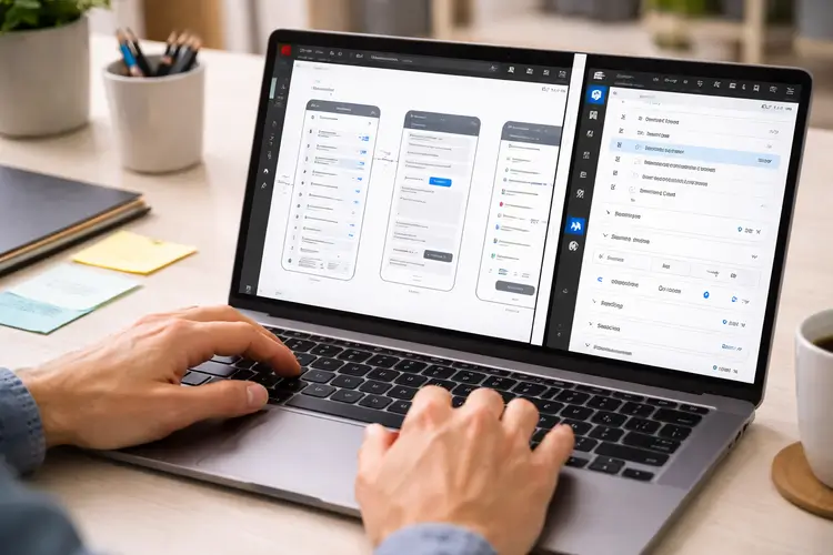
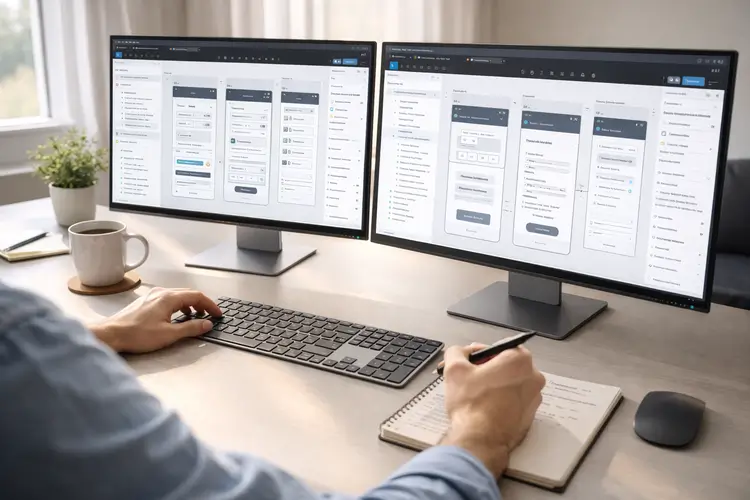
Figma Auto Layout is a feature that allows elements in your design to automatically adjust based on content and rules you define. Instead of manually resizing and repositioning items, Auto Layout handles spacing, alignment, and responsiveness for you.
This means your designs behave more like real applications, where components adapt dynamically rather than staying fixed. For beginners, this is a major shift. Instead of thinking in static layouts, you start thinking in systems and relationships between elements.
Why Auto Layout Is Essential for Beginners
When you’re starting, it’s tempting to focus only on visuals. But in real-world design, structure matters just as much as appearance. Auto Layout helps you maintain consistency across your designs. It ensures that spacing, alignment, and proportions stay uniform, even when content changes.
It also prepares you for working with developers. Many of the concepts behind Auto Layout are similar to CSS layout systems like Flexbox, making collaboration much smoother.
Understanding Frames vs Groups
One of the first things to learn is the difference between frames and groups. This distinction is critical because Auto Layout only works with frames. Frames act as containers that can hold elements and support layout behavior. They can be resized, aligned, and structured using Auto Layout settings.
Groups, on the other hand, are simply collections of elements. They don’t respond dynamically and cannot use Auto Layout features. For this reason, it’s best practice to always use frames when building UI components.
Direction: Building Layout Flow
Auto Layout works by organizing elements in a specific direction. You can choose between vertical and horizontal layouts depending on your design. A vertical layout stacks elements from top to bottom. This is ideal for forms, cards, or content sections where items follow a natural reading order.
A horizontal layout places elements side by side. This works well for navigation bars, toolbars, or rows of buttons. Choosing the right direction helps create a clear and intuitive structure in your design.
Spacing and Padding: Creating Visual Balance
Spacing is one of the most important aspects of good design, and Auto Layout makes it much easier to manage. You can define the space between elements using consistent values. This ensures that your design feels balanced and organized.
Padding controls the space inside a container, keeping elements from touching the edges. It creates breathing room and improves readability. Using a consistent spacing system, such as increments of 8 pixels, helps maintain a professional and cohesive look.
Resizing Behavior: Making Designs Flexible
Resizing behavior determines how elements adapt when content or container size changes. This is where Auto Layout becomes especially powerful. “Hug contents” allows an element to adjust its size based on what’s inside it. This is useful for text labels and buttons that need to grow or shrink dynamically.
“Fill container” makes an element expand to take up available space. This is ideal for responsive layouts where components need to stretch. Fixed sizing keeps elements at a constant size, which works well for icons or images that should not change. Understanding these behaviors helps you create designs that feel natural and responsive.
Alignment: Controlling Positioning
Alignment defines how elements are positioned within a frame. Auto Layout gives you control over both horizontal and vertical alignment. You can align items to the left, center, or right, and also control their vertical positioning. This ensures that your layout looks clean and intentional.
Proper alignment is especially important when designing components like cards, headers, or navigation bars, where clarity and structure matter.
Nested Auto Layout: Building Real Interfaces
As your designs grow more complex, you’ll start combining multiple Auto Layout frames. This is known as nesting. For example, a card component might contain a header, content section, and footer. Each of these can have its own Auto Layout settings.
This approach mirrors how real applications are built. It allows you to create reusable components that can be easily updated and scaled. Once you understand nesting, you can design entire pages efficiently without losing consistency.
Common Mistakes Beginners Should Avoid
Many beginners make the mistake of using groups instead of frames. This limits flexibility and prevents you from using Auto Layout effectively. Another common issue is relying too much on fixed sizes. This makes designs rigid and harder to adapt when content changes.
Inconsistent spacing is also a frequent problem. Without a system, designs can quickly feel messy and unbalanced. Finally, not naming layers properly can create confusion, especially when working on larger projects or collaborating with others.
How Auto Layout Relates to Real Tech Skills
Auto Layout is not just a design feature; it reflects how digital products are actually built. Developers use layout systems like Flexbox and Grid to create responsive interfaces. Auto Layout follows similar principles, making it easier to translate designs into code.
This means that by learning Auto Layout, you’re also building a foundation for understanding front-end development concepts.
Practicing Auto Layout Effectively
The best way to learn Auto Layout is through practice. Start by recreating simple interfaces, such as login forms or mobile screens. As you gain confidence, move on to more complex layouts like dashboards or landing pages. Focus on consistency and responsiveness.
Building reusable components is another great exercise. It helps you think in systems rather than individual elements.
If you want to accelerate your progress, structured learning can make a big difference. Code Labs Academy’s UX/UI bootcamp offers hands-on projects where you can apply these concepts, build a strong portfolio, and receive mentorship from industry professionals.
When to Use (and Not Use) Auto Layout
Auto Layout is ideal for structured designs like buttons, lists, forms, and reusable components. It helps maintain consistency and adaptability.
However, it’s not always necessary for freeform designs or complex illustrations. In those cases, manual positioning may be more appropriate. Knowing when to use Auto Layout is just as important as knowing how to use it.
A Simple Workflow to Get Started
Getting started with Auto Layout is straightforward. Select your elements and apply Auto Layout using a simple shortcut.
Once applied, you can define direction, spacing, padding, and resizing behavior. These settings give you full control over how your layout behaves. With practice, this process becomes second nature and significantly speeds up your workflow.
Final Thoughts
Figma Auto Layout may feel unfamiliar at first, but it quickly becomes one of the most valuable tools in your design process. By focusing on core concepts like direction, spacing, resizing, and nesting, you can create layouts that are both flexible and professional.
For anyone considering a career in UX/UI design, mastering Auto Layout is an essential step. It not only improves your design skills but also prepares you for real-world collaboration with developers and product teams.
If you're ready to take the next step, exploring a structured program can help you gain job-ready skills faster. Code Labs Academy provides hands-on training, portfolio development, and career support to help you transition into the tech industry with confidence.